Evaluation

Evaluation Activity 4

Hardware
Evaluation Activity 4 - Hardware Collage Image

Above is a collage of the hardwares used during this A2 media project. It was created using Microsoft Word 2000, and was then screenshot and exported into paint in order to save the cropped file as a PNG image.

  1. iPhone 5 – The iPhone 5 was a great asset to use throughout this year. Other than the vast number of apps which helped a great deal (and will be mentioned later under the ‘software’ heading) but it also holds a very handy torch which actually produced sufficient light for some of the shots we captured when filming in London as well as the photo shoot we held for the images on the poster and digipak. Its pocket-size scale means it is always with me and therefore was exceptionally accessible, quick and easy to use. Through using the phones iPod feature, we were also able to play the song for our music video in the background while filming to ensure the lip-syncing was in time with the track. However, one problem with using an iPhone so extensively when filming outside, on location and away from home is that the battery life is really quite poor. We overcame this problem by taking more than one iPhone, however in the future it may be a better idea to take a torch separately and use the iPhone purely as a source for the music so that we could use this feature throughout the duration of filming.
  2. Steadicam – We used one of these weighted steadicams when filming a majority, if not all, of our shots within our music video. It is a great tool to use as it meant that all shots were smooth and professional looking without having to use unreliable computer software in the editing stages of our video. From previous projects we had used iMovie to stabilise shots and this made for a jumpy, zoomed in effect which is not what we were after and so for our final music video we planned to use a professional steadicam that is used within the industry often. The negatives of using such equipment are its large-scale and weight, this made it harder travel with around London as the tube trains were our main mode of transport, where it is often cramped and claustrophobic. A final issue with this equipment is the time it took to set up. It is a relatively complex tool that has to be assembled, weighted and balanced before use, this slowed us down at times and meant we had to assemble the steadicam before we left home to begin filming in London.
  3. Canon SLR camera – This is the camera we used for all of our shots when filming for our video. We found that it is extremely reliable and produced shots of a high quality. It has many features available that helped us out greatly such as a flash and manual focus and zooms on the lens. Although it has many professional features, it was also relatively easy to use and get the hang of. This was ideal as before filming we had limited time to test our equipment. Again, a problem we encouintered was the weight of the camera when walking and travelling around London, however, we coped and are very happy with the quality of our final music video.
  4. Apple Mac Computer – We chose to use an Apple Mac computer to edit our music video as it has all of the software that we were comfortable using and it also has a very friendly user-interface. The computer was very accessible to us both inside and outside of school and so we were always able to pick up from where we left off and continue to edit our video which was very helpful. We used iMovie on the mac to edit our video, which will be mentionned later on uder the ‘Software’ sub-title.
  5. Three-point lighting kit – The three-point lighitng kit was very useful for us when filming the shots within the music theatre. Due to health and safety issues, we were unable to use the spotlights that are already fitted within the theatre and so we had to source lighting of ourselves. I feel that the lighting worked exceptionally well within the theatre sequence as it looks like a single spotlight has been employed. For the future, it is important that we check all of the equipment is working before we take it out to film as we were unable to use one of the lamps, due to faulty wires, luckily, this didnt effect us as we wanted a spot-light effect anyway so the fact we could only use 2/3 lights really wasnt a big issue. Using this lighting kit is also very time-consuming and so ate into the time we had filming. In the future we shouldn’t under-estimate the time it takes to set up the equipment that we plan to use.
  6. Tri-pod – We used the tri-pod extensively during the production stage of our music video. Its ability to fold-up makes it very accesbile and easy to travel with and it is also relatively light-weight. Using it meant that all of our static shots are completely still, without jolting or at an odd angle. This makes the overall look of the video appear far more professional and the shots fit in seamlessly next to the more gliding kinetic shots that we had. Furthermore, it is a great feature, that you are able to adjust the height of the tri-pod, this makes for a wider variety of shots and makes for a more interesting viewing experience.
  7. Windows 7 Computer – We used a Dell computer with Windows 7 for many different aspects throughout the year. Its wide range of uses made it an extremely valuable piece of hardware for us. These uses include: Posting to our blog, Microsoft Word, Powerpoint, Publisher, Internet Applications, Photoshop and accessing our emails. Again, we have hundreds of computers available to use throughout the school where we can easily login and access all of our own personal documents from anywhere making working on this project very quicka and easy. Ellena and I also have access to a Windows computer at our homes, meaning we could continue after school hours.
  8. SD Card – A final key piece of hardware that we used was the SD card. This was the storgae device that we would insert into the camera, record our footage on to and then transfer into the computer in order to begin editing the shots we had captured. It is extremely small which meant we could carry it with us anywhere as it fit straight into our pockets and made any shots we had to be easily transported between home and school. It was important for us that we used an SD card of the highest quality which is why we used one with a ’10’ rating meaning that it will capture film in the best quality possible. Problems we encountered with this SD card was the amount of film that it could hold. Sometimes we found ourselves in the situation of having to delete some older footage off of the SD card in order to continue capturing new footage. Finally, its small size meant

Software

Picture3

1. iMovie- This is the main software we used to upload and edit footage and create our final cut of our music video. We progressed from how we used iMovie in our AS final task, as we used a newer version of iMovie, allowing us to utilise much more advanced features. We found that using this specific software out of the different options available to us gave us much better accessibility to our footage, as we uploaded it onto George’s Apple laptop, which allowed us to be able to work on the video at home as well as in school. It is also moderately easy to navigate around, which allowed us to start work straigh away, without having to watch more than one or two tutorials (these gave us added skills on how to create effects we did not automatically know how to do) which was hugely beneficial to our time management and helped us to easily reach our deadline.

2. Photoshop- This is the main software we used to create our ancillary tasks-both the digipak and the poster. Using Photoshop is a progression from last year as we limited our software usage to iMovie, and microsoft office to create images. This software is used in the professional media industry, and therefore possessed many advanced features that we were able to utilise to their full potential- e.g. airbrushing, shading, template using, shape creating, editing the colour pallette, layering the image, and cropping and rotating. These features along with many more allowed us to create a much more complex image in terms of layering and the the extent of editing we could do to the artists face in pictures in order to create a realistic portrayal of the media industry today, even if that did mean that she was portraying unnattainable beauty. Overall, we found using Photoshop extremely successful in terms of our aims and how achievable these became with the software, as well as how simple and fast it became to use.

3. Google- This was our primary search engine used throughout the course. Both of us use Google in our daily lives, academically and recreationally, as it is fast, efficient, and displays results in an accessible, easy to read way. Using a search engine was particularly useful in the research stages to be able to look into other products and also at other coursework student blogs for guidance and inspiration.

4. Soundcloud- We used thsis software when sharing vocal feedback from our teachers on our blog. Soundcloud also has an app that we both downloaded onto our iPhones, which increased the accessibility with the wide media platforms that it crossed over onto. Soundcloud is a fast and simple software that allowed us to share via an embed and a link onto our wordpress blog, which displays our use of different media within the course.

5. WordPress- This has been the software used to display all of our coursework throughout both AS and A2, in the form of a blog. WordPress has allowed us to converge with social media throughout the different posts with links to Facebook and Twitter, as well as being a software that not only displays our work in a tidy and clear layout, but allows us to insert and embed links from other software, such as slideshare and soundcloud, in order to make our blog interesting and stimulating to read. WordPress also has the option to include categories and tags within our posts, which helped us to order the posts in an accessible way when wanting to find one specific post for either research purposes, or when reflecting and evaluating upon our work.

6. Scribd- This software allowed us to export a Microsoft Word document that would not normally embed into WordPress into Scribd, and then create a link that we could insert into a blog post to display the writing as it was on the original document, in the same format (regarding fonts and images etc). Using Scribd is extremely useful in partnership with using WordPress because it is a quick and easy way to insert a document into the Blog that may have contained writing that we could not display in any other way. We used this most in the research process, as we evaluated and analysed many other music videos through Microsoft Word.

7. Slideshare-  This software allowed us to export a Microsoft Word document that would not normally embed into WordPress into Scribd, and then create a link that we could insert into a blog post to display the writing as it was on the original document, in the same format (regarding fonts and images etc). Using Scribd is extremely useful in partnership with using WordPress because it is a quick and easy way to insert a document into the Blog that may have contained writing that we could not display in any other way. We used this most in the research process, as we evaluated and analysed many other music videos through Microsoft Word.

7. Slideshare-   This software allowed us to export a Powerpoint document that would not normally embed into WordPress into Scribd, and then create a link that we could insert into a blog post to display the writing as it was on the original document, in the same format (regarding fonts and images etc). Using Scribd is extremely useful in partnership with using WordPress because it is a quick and easy way to insert a document into the Blog that may have contained a presentation that we could not display in any other way. We used this most in the research process, as we evaluated and analysed many other music videos through Microsoft Powerpoint.  

8. Microsoft Office- This is the overall name that contains many other layers underneath of software that was extremely useful to us throughout all the tasks- Word, Powerpoint, Publisher, Outlook.

9. YouTube- Youtube, to a media student, is extremely important. Firstly, we used this extensively throughout our planning and research stages, to watch a range of media videos, both genre specific and non-specific, in order to gain an understanding of music videos and the basic conventions. It also gave us the bulk of our inspiration, through looking at music videos from artists such as Lana Del Rey, Adele, and Beyonce. We could then zoom into the genre we chose of pop, and look at the conventions for pop music videos, and female artists such as our artist, Ameli, and gain ideas and a knowledge of different shot types, editing techniques, and general stereotypical compartments of a music video of this genre. YouTube was then extremely important in sharing our music video, both the draft which we could then gain feedback from, and the final cut to share our hard work. YouTube is probably one of the most visited websites on the worldwide internet, with billions of  users, and it is specifically useful in the way that they heirachy between the producer and the consumer has been broken down, allowing us to be the users getting use from the product, and be the importer of produce, when uploading videos and sharing them for the users of YouTube to see. YouTube is also an app that is automatically on the apple iPhones, which we both own, which therefore increases the platforms that we can access it on (e.g. computer, iPhone, iPad, iMac, Dell Laptop etc). YouTube also creates a simple link which we could copy and paste into social networking sites to gain feedback from, as well as YouTube having its own feedback or ‘comments’ section, which other uses would be attratced to through the use of categorising our video through hashtags on twitter and  facebook, and the ‘similar videos’ tab on the right hand side of the YouTube screen.

10. MyBrainShark- This is the software that we used in the evaluation stages to evaluate our draft and final versions of our ancillary tasks- the poster and the digipak. This allowed us to both display words and images associated with the ancillary tasks, and have a voiceover of  us both talking more extensively and in depth about these, letting us explain our choices and our feedback in more detail.

11. AppStore- This is the apple software that is automatically on every apple product you purchase, which is a platform for all apps, which most of the software we used had. Having an app on the homepage screen of an apple digital product allows quicker access, and a more efficient way to switch between different software whilst keeping the previous information alive in another app.

12. Wordle- Wordle was the software used in Evaluation Question No.2 to create a visual image of the different feedback tag lines from our draft and final cut of our music video. This was a new software we had not used before which we found fun to use, and makes our blog more interesting and visual stimulating to read

13. Facebook- We used Facebook as our primary social networking site, in order to gain feedback for both our draft and final cut, allowing us to make the approrpiate changes, according to what the feeback was. Facebook also contains mostly our target audience, as nearly all of our friends are of the ages of 16-20, which is part of the age range we were hoping to attract. Facebook also allowed us to reach a wide range of people that we would not see daily to physically show them the final cut, and therefore gained us much more complex and variable feedback.

14. Twitter- Twitter was our secondary social networking site that we used to gain feedback. By using hastags we could try and subliminially narrow the audience that would be viewing our music video, by categorising it in with other posts such as ‘#1920’s’ #’Great Gastby’ ‘#Media A2’, which would attract viewers similar to us.

15. iMessage- This is the messaging software used on Apple products, which allowed me and George to stay in constant contact with eachother, even when he was using his computer (the iMac which also has iMessage built in). It also gave us access to send eachother pictures and links quick and easy, as well as free, which increased our time managment skills, and allowed us to stay on the same page throughout both the research and shooting stages. George could also have constant access to our actress, Hannah, sending her pictures and links of ideas of costume, location, and tutorials on acting and lip syncing, which gave us an easy platform to get in contact with her if we wanted to change anything we had previously told her.

16. Apple- This is the main umbrella which many of the software I have just talked about is under – The App store, iMessage, YouTube, and many of the software features such as the actual apple physical products (see above).


Standard
Digipak, Evaluation, Feedback, Poster, Target Audience

Evaluation Activity 3

Part 1
Treatment

Wordle: Treatment - Feedback
By collecting this feedback for our treatment we learnt of how we could further develop our initial ideas in order to give us the best start in beginning to think about the production of our music video. Presenting to the class gave us the opportunity to thoroughly talk through our initial ideas and gain any feedback from our target audience directly, this was particularly helpful also as the people we presented to were our media class mates and so they could see our idea from a technical perspective and covered all of the key points within media such as lighting, location, camera-work, mise-en-scene, sound and performance. Producing the treatment was a good way for us to get down all of our current ideas and see how they would work with each other and helped us to develop the overall look and theme of the video that we were after. Some key points we took away from the treatments feedback was that we needed to think carefully about lighting when shooting at night in an external location in a busy city; we have to carefully consider the locations and whether they are easily accessible and will look professional and we also came out with more sources of inspiration that we were able to research and reflect in our video such as Woody Allen’s ‘Manhattan’.

Animatic
We gained a whole lot of feedback during and after the production of our animatic from class comments; a teacher’s soundcloud recorded criticism; a vlog and some various other pieces of general comments from our other teacher. Below is a Wordle image that presents some of the key words and phrases that we got from the feedback and learned from when creating our final music video:
Wordle: Animatic Feedback
The various sources of feedback for our animatic helped a great deal as we were criticised by a variety of different people that look for different elements in the music video; such as our teachers looking at the technical side of things; class mates also looking technically but also looking as though they are the target audience; and general comments from friends and family who generally look at the overall theme and artists identity. From the wordle it is clear to see that we took away a lot of key points from the people asked. We found that we had to begin to consider the timing of the shots and how well they would reflect the lyrics, beat and rhythm of the song at the time it showed as we had previously under-estimated how little time we had to convey the narrative and all of the shots we had originally planned. Moving forward we feel it would be a good idea to produce an animatic right from the start so that we are always considering timing and camera shots so that in the future we aren’t disappointed and have to change our narrative to fit the length of the song. We also learnt that although animatics are meant to be basic diagrams, it is important not to forget the finer details that we will later have to consider during production such as camera movement, mise-en-scene, lighting, location and costume. General opinions were very positive which provided us with encouragement and meant we could move forward with our idea but had it not gone so well, from receiving this feedback, we then would have had enough time to change anything before it would be too late.

Part 2
Teacher and Peer feedback from Dailies

This spidergram, made using ‘Spiderscribe.net’, displays our feedback, both positive and negative, from our teachers and classmates after showing them primary footage that we shot as test shots before shooting the rough cut and then doing further shooting and editing to progress into the final cut. It also has feeback from our rough cut.

spiderscribe

Teacher Feedback-

When looking at our teacher feedback from our Dailies session, it is evident that we took many of this contructive criticism on board and utilised it when shooting the rough cut, as well as taking the strengths identitified by our teachers and featuring these more in our music video knowing that they worked well to an audience watching it. One of these was the comment about developing camera movement, which was also mentioned regarding the pan by our classmates, which we tried to focus on a lot during our music video, as we realised through further feedback of our rough cut that the constant movement was successful and made our shots look very professional. We used the stedicam for the first time to achieve these shots, which was also another comment made by our teacher. We did try to feature the fairy lights both by the embankment and at Harrods, in our location shots as our teacher fedback that they were effective lighting that were already in place for us, and therefore helped us to require no lighting kits when travelling to and shooting in London, leaving us more time and concentration to focus on the locations, the tracking shots, and the costume and props. We did also add in an establishing shot of the artist into our rough cut after the feedback from our teacher, as he informed us how it was essential to establish the artist’s full body in order to create her identity clearly to the audience. This is seen briefly in our opening sequence of our music video, whereby we have a long shot of the artist’s full body on the stage.

Classmate Feedback-

The feedback from our classmates was mostly positive, which we were really flattered to receive! We were commended on our use of lighting and the class thought the use of the black and white effect was really effective, and also commented how we could use this in the future in the digipak and ancillary tasks, to connect them together with a common theme. As this contains feedback after showing our classmates the rough cut, some of the class commented on the movement and pan’s throughout the video, and how these really help our video look professional, and should be included even more in the final cut. We took this feedback on board, and to achieve this in our final cut, used the editing software, iMovie, to be able to crop existing shots and pan across them, as well as zooming either in or out. This increased the movement and fluidity of the shots and transitions from one scene (location) to another, as seen in our last location down the alley.

Other Feedback-

image

This screenshot demonstrates how we used social media (Facebook) to be able to communicate with our audience, promote our artist, and gain vital feedback from people who had not been following our progress in the classroom, like our classmates. We had all positive feedback on this Facebook post, commenting on the effects such as Black and White, the movement in the shots, and about how professional the overall feel of the video was.

Part 3
bs

http://my.brainshark.com/EVALUATION-ACTIVITY-3-622302973

Standard
Evaluation

Evaluation Activity 1 – George Lawrence

In what ways does your media product use, develop or challenge forms and conventions of real media products? (i.e. music videos)

9 frame

In order to create the 9 shot frame grid situated above, I used Adobe Photoshop Elements 4.0.
Photoshop Editing

  1. A shot that shows a link between lyrics and/or music and visuals
    This extreme close-up shot, shows a large glamorous diamond ring being adorned on the hand of our artist, Ameli. This well reflects the lyrics that are sung at this exact point in our music video which are, “physical things”, within the context of the rest of the song, hints at the fact that she doesn’t need these material possessions because all she wants is the man she loves. We continue to reflect this rejection of her personal possessions later in the video also as there is a short sequence displaying our artist ripping off the ring from her finger. This particular shot is part of a quick montage of shots that displays various other material things including a watch, cufflinks and our artists glamorous dress. The cuts in this montage match the intonation, speed of the lyrics and number of syllables in the two words as they are spoken.
    [CUT]phy[CUT]si[CUT]cal[CUT] things – matching the 4 shots of the montage.
  2. A shot that typifies the way a record company would want their artist to be represented
    I have chosen this wide over-the-shoulder shot to represent a shot that typifies the way the record company would want the artist to be represented as we see Ameli in her prime environment in which she flourishes. She is shown performing on a stage which instantly highlights the fact that she is a grand performer, and often when this type of location is depicted within a music video it produces a vision of the artist being a ‘diva’ that demands all eyes on her, much like Beyoncé in her music video for ‘Listen’. It is this type of old-fashioned glamour and star quality that we aimed to replicate for our artist’s identity. We can see the era that Ameli s replicating through her sense of style and costume. The over-the-top sequined floor-length dress adds to the sense of occasion and her hairstyle is that of the 1920’s which is becoming increasingly popular once again in today’s society. She is being looked up at from a low-angle displaying her as a figure that young girls would like to replicate and get inspiration from. Our aim was to make her look as ‘perfect’ as possible in order to fit in with so many other female artists in the music industry which try to portray what society would class as the female ideals.
  3. A shot that illustrates how your video uses music genre
    With our artist being categorised in to the Alternative-Pop-R&B genre it was important that we captured the video in a way that would appeal to a broad audience but while sticking to the genre specific conventions. Close-up head-shots are used generously within these genres as they best represent the artist, their image and the emotions they are feeling. This particular screen-grab typifies a shot you would expect from our genre as it is a close-up that clearly depicts our artist situated in a glamorous London location by the river with the skyline in the distance. This beauty shot appeals to many people as it is a person girls want to replicate and be while it is also a person boys want to be with.
  4. A shot that shows an intertextual reference
    This shot is perfect in displaying one of the intertextual references that we had within our video. For the sequence that were shot on stage we made up a large paper cut-out of our artist’s logo and stuck it to the back wall of the stage. It stood out tremendously against the plain white canvas adding to the overall mise en scene of the shot however, also served us very well as the audience would subliminally see the logo in the video and then whenever they saw it placed anywhere else (for example, a promotional poster down the street) they could instantly relate the two together and know of its association with Ameli.
  5. A shot that demonstrates your use of camera
    Shot number 5 from the 9 frame grid above is a good example to use when displaying the camerawork that was employed during the filming of the music video. I chose this moment in the music video as it required the most amount of skill and had the most movement in this one shot. We used the stedi-cam in order to improve the quality of the footage and steadiness so that this didnt have to be done during editing at a later stage. With the equipment I then slowly moved around our artist in order to get a nice moving, panning shot of her face as she is about to perform. While moving around slowly I was also required to manually change the focus of the lens in order to produce a nice push-pull focus affect. Overall, I am very pleased with the final outcome of this shot and the camerawork that was required to produce it.
  6. A shot that demonstrates your use of lighting
    Another close-up, here, is a good example of the lighting we had to employ for the shots on the stage. We used a three-point lighting kit but was only required to use one of the three lights that were provided. We felt that this would be best as we wanted to make it look as though a real spotlight was used. We had originally intended to use the spotlight in the theatre but this was not possible due to health and safety issues. I feel that this one strong light source placed directly in front of our artist worked particulaurly well and actually probably provided us with more light that the spotlight would have done had we been able to go with our original plan. It well highlights our artist and the beauty that we want to be represented.
  7. A shot that demonstrates your use of mise-en-scene
    The over-the-shoulder high angle shot from behind our artist looking down towards her one man audience is a good shot to look at when analysing the mise en scene used within this sequence. This shot focuses on the man and so here we can clearly see his costume. He is wearing a smart three piece suit along with a fedora hat that was very popular back in the 1920’s, the bow tie which adds to the smart occasion and performance, with the table lit by candle-light. The use of the candle, gives a generally more period feel but also heightens and hints towards the looming romance that is to occur. The vast spread of floor behind appears to have no end and is only subtly lit by moon-light. It well gives the feeling of a gentlemens club with the theatre having been emptied out after closing time and has left us with a private performance from the clubs in-house performer.
  8. Two shots which you feel demonstrate something which shows you have watched other music videos
    Shot number 8 is one of my favourites. It demonstrates something which shows we have watched a different music video already in the professional music industry as it closely mirrors shots from Justin Timberlake and Jay-Z’s music video for their song ‘Suit and Tie’. The way that the artist is shown in a silhouette with a strong light source directly in the centre of the shot is a great way in giving off the impression of a spotlight and a grand performance on stage. Although we see little detail of Ameli or Justin Timerlake, they are centre of the shot and the main focus as we eagerly anticipate the beginning of their performances.
    8 JT
  9. Two shots which you feel demonstrate something which shows you have watched other music videos
    This mid-shot with the artist placed to the left side of the shot with the out-of-focus city lights in the background was inspired by the music video that was made to accompany Ed Sheeran’s song ‘A Team’. Both show the protagonist as she walks through the streets of London and are from an appropriate distance from the artist/character in order to see the emotions on their faces as they struggle to either survive on the streets or find their lover. Both shots help to progress the narrative of the videos while seamlessly fitting in the with performance shots that are shown throughout the remainder of the video.
    9 ES

Screengrabs from other, real music videos in the industry:

9 frames

In order to create this 9 shot frame grid I used a newer version of Photoshop called Adobe Photoshop CS6 Extended.
Photoshop

  1. A shot that shows a link between lyrics and/or music and visuals
    For this convention of a music video I chose a shot from Katy Perry’s ‘Firework’ video. This carries the convention the whole way through the video but none more so than the final chorus when the lyric exclaims “-‘cos baby you’re a firework”, at this point of the video, Katy can be seen dancing in the centre of the screen of a low angle mid/wide shot, with shooting fireworks surrounding her. When the lyrics of the song and the action in the video match, I feel it is a great moment as the audience can put the song into context and makes the whole listening and viewing experience combine and is more enjoyable.
  2. A shot that typifies the way a record company would want their artist to be represented
    When Taylor Swift first began to make it big worldwide she had a very vivid country identity, her first breakout single ‘Love Story’ typified this innocent, pretty and cute image that the record company were so eager for her to represent. This particular shot displays the country ideals with the location being a country field with rolling lawns and the costume is also key to her identity. She wears elegant yet age-appropriate clothing that doesn’t show too much skin which so many young female artists are prone to do in today’s society. The high angle makes Taylor appear young, vulnerable and innocent running towards her love. This simple and classic scenario appears in many country genre videos and aids Taylor’s country life-style, girl-next-door identity.
  3. A shot that illustrates how your video uses music genre
    ‘Bound 2’ is the highly controversial newest single from the rapper Kanye West due to its explicit content and amateur style video quality. However, it is still a good case study to look at when giving an example of a video that conforms to the conventions of its genre. The shot displayed above depicts Kanye West and his fiancé Kim Kardashian (the mother of his daughter) explicitly riding a motorcycle while Kim is naked. A common theme within the rap genre video is expensive vehicles as it is a way for rap stars to display their wealth. Furthermore, young women with very little clothing is also an image that is often seen and backs-up Laura Mulvey’s Male Gaze theory with a wide range of the rapping community being men.
  4. A shot that shows an intertextual reference
    The 1975 is a relatively new band that have recently made it into the charts with songs from their self titled debut album ‘The 1975″. Their video for the song ‘Girls’ draws upon one of the most iconic music videos ever, that is Robert Palmer’s ‘Addicted to Love’ with the famous supermodel girl band. When modern audiences watch the music video for ‘Girls’ – if they know of Robert Palmer – they will immediately get the reference and associate one with the other. It works well as we can see that this new band would love to become as successful as Robert Palmer who sets a good example within this indie-rock popular genre. This particular shot clearly displays the whole band of glamorous women and is the same long shot type as is used in ‘Addicted to Love’.
    Screen Shot 2014-03-06 at 17.33.30 Screen Shot 2014-03-06 at 17.37.16
  5. A shot that demonstrates the use of camera
    Shot number 5, is a screen grab from one of Miley Cyrus’ first singles away from being her alter-ego on screen personality Hannah Montana. This is a good example of camerawork within a music video as interestingly, the whole video is shot in one long continuous shot. While this goes against regular music video conventions, it works well in highlighting the artist and so therefore, does follow the usual stereotype of a Pop music video as it solely concentrates on the artist and their promotion.
  6. A shot that demonstrates the use of lighting
    ‘1+1’ is the massive hit song from Beyoncé. Shot number 6, shown above is taken from the promotional video that accompanies the song. This video uses interesting and circling lighting around the artist in order to highlight the artists face as she performs the song. The head shot close-up draws all attention to Beyoncé as she sings, even more so as she is placed against a plain black background which absorbs any lights and so doesn’t reflect it. This exemplifies the ways in which real music videos in the professional industry use lighting in a way that highlights and beautifies the artist.
  7. A shot that demonstrates use of miss-en-scene
    Lawson, a pop boyband, employ a wide variety of elements in order to make for a believable environment in their music video for the song, ‘Juliet’. Firstly, they have chosen a location that well reflects a gentlemen’s club, much like the one that we aimed to re-create when we produced our own music video. The dimly lit room along with the red draped walls make the environment appear ever-more sleazy and sexual yet love-orientated. The lack of light adds to the mystery but the stage-lighting clearly shows that there is a performance, it blinds out and de-faces the audience which adds to the ideas that they shouldn’t be there and could be there for the wrong reason. The audience can be seen wearing glamorous 1920’s inspired outfits which adds to the overall miss-en-scene and makes the scene look generally more believable. It is these small elements such as costume and small insignificant props like drinking glass types that add to the final aesthetics of a scene.
  8. Two shots which you feel demonstrate something which shows you have watched other music videos
    As previously mentioned, when producing our music video, we looked at Justin Timberlake and Jay-Z’s music video for ‘Suit and Tie’ for inspiration. It is a shot type that is used widely within music videos in the professional industry when the location is that of a theatre or a performance on a stage. I believe it is used so much as it is a good way in showcasing your artists stardom and their level of demand.
    MENTIONED PREVIOUSLY (Shot number 8 is one of my favourites. It demonstrates something which shows we have watched a different music video already in the professional music industry as it closely mirrors shots from Justin Timberlake and Jay-Z’s music video for their song ‘Suit and Tie’. The way that the artist is shown in a silhouette with a strong light source directly in the centre of the shot is a great way in giving off the impression of a spotlight and a grand performance on stage. Although we see little detail of Ameli or Justin Timerlake, they are centre of the shot and the main focus as we eagerly anticipate the beginning of their performances.)
  9. Two shots which you feel demonstrate something which shows you have watched other music videos
    This was the second shot that I chose to resemble in our music video. Its a simple shot but works well in a city location which was one of the reasons that we chose to re-create it. For a song such as ‘A Team’ which tells the story of a young lady struggling to live on the streets and dealing with drugs and prostitution, it is extremely important to capture the emotions of the characters or artist that is involved in the narrative. As our video also contains a relatively gritty narrative of a young lady that fails to capture the heart of her love interest and so is left to traipse the streets of London in order to find him, we also needed to employ shots that would display the characters emotions.
    MENTIONED PREVIOUSLY (This mid-shot with the artist placed to the left side of the shot with the out-of-focus city lights in the background was inspired by the music video that was made to accompany Ed Sheeran’s song ‘A Team’. Both show the protagonist as she walks through the streets of London and are from an appropriate distance from the artist/character in order to see the emotions on their faces as they struggle to either survive on the streets or find their lover. Both shots help to progress the narrative of the videos while seamlessly fitting in the with performance shots that are shown throughout the remainder of the video.)

Digipak Comparisons

Front

The-Great-Gatsby-Soundtrack-Album-Cover-Deluxe1     321862_1280

Above is our album artwork front pane of our digipak and below are two examples of real album artworks in the industry; the Great Gatsby film soundtrack and then Beyoncé’s most recent self-titled visual album. Both of which share similarities to our own digipak and reflect the conventions of their respective music genres.

The Great Gatsby Soundtrack CD is a collection of all of the music that features in The Great Gatsby film and is therefore made up of a variety of artists. The cover therefore doesn’t particularly reflect the identity or style of an artist but more so a general era and theme of the film. Our artist does have a strong identity which matches with this 1920s era which is why we gained inspiration from the art deco lines and fonts. The colour scheme we felt also worked well and so replicated this as it also worked with the black and white filter that we had employed in our music video.

Beyoncé is an artist that represents the Pop-R&B genre and is seen as one of the most influential and successful artists of our time. It is for these reasons that she aims to defy regular conventions and be revolutionary and a trend-setter as opposed to being a sheep and following rules and regulations that were created in the past. I believe that within the Pop and R&B genres – as strange as it sounds – it is rapidly becoming the convention, to go against conventions. What I mean but this is that today, every artist within these genres aims to be the best and try something new. For example, there is Beyoncé releasing her album with no prior warning whatsoever with one of the simplest front covers to ever adorn the work of one of the biggest stars in history, Lady Gaga releasing the first ever black liquid fragrance, Katy Perry releasing her SCENTED ‘Teenage Dreams” album or Kanye West releasing his ‘Yeezus’ album with no artwork at all, just a simple luminous orange-red sticker on the side of the hard copy. It was our idea to then follow these artists by trying something different with our albums artwork and so we decided that there would be a cutout in the shape of our artists logo which would make way for a headshot image of our artist to show through which is printed on the panel behind the front pane. To my knowledge this has never been done before and so is a good way to be unique and draw attention to our artist’s debut album. We followed the current fashion, however, within the pop industry and that is to have a self-titled album which is the only text that we have featured on the album cover, much like BEYONCE.

Back  borntodie

Pictured above is the back pane of our digipak on the left, next to the back pane of Lana Del Rey’s ‘Born to Die’ album digipak. Lana del Rey is an artist whose identity we were very intrigued with from the start as she has managed to create a very vivid image for herself which is reflected in the various other forms of media that she is associated with. We therefore adopted a similar layout to that of Lana’s with that song titles being the main focus of this panel which I feel is very important as the songs are the product and so need to be promoted very clearly. We followed the conventions in using a very simple colour scheme that matched the rest of our digipak with the same border. It was also important that we included all of the necessary key information and small print to this panel also, not only is it a requirement but it also makes the pane appear generally more professional and realistic and as though it would fit in well on a shelf in a hmv store. We also felt it was important to include the artists logo subtely, it helps the intertextuality and continuity of the piece as a whole.

Advert Comparison

poster

48f15b0877383_60130n                  circus poster

Lily Allen is one of the most internationally successful British artists within the pop industry and so it is important to look at the ways she is promoted in order to gain an idea of what is the most common conventions of this genre. Like our poster, Lily’s has one main large image with the sole focus being on her, the artist. This makes any poster instantly recognisable and its purpose is very obvious – self promotion. It includes all of the necessary information such as the album’s title, the artist’s name and information on where it is possible to get your copy of the album. We also copied the way in which that it is all laid out very evenly and is balanced which makes the finished poster simply more aesthetically pleasing and easy on the eye. The fun shapes and cartoon imagery is very reflective of Lily’s young and fun personality and so we too decided to choose imagery, fonts and colours that well reflect the classy, elegant and glamorous nature of our artist. Finally, this poster also includes a review, we feel this is a good decision to any promotional poster as it reassures any potential buyers that they are spending their money well and can just be the last push needed to  influence a person to make a purchase. It is for this reason that we added 3 reviews with a 5 star rating from appropriate publications that relate the genre of our music and the artist’s identity.

When researching popular female pop solo artist promotional posters I came across the poster on the right which was used when promoting Britney Spears’ sixth studio album ‘Circus’. I feel it fits the general theme of this album with the circus font, colours and layout and so works really well. It fits in well with her various other promotional materials such as her album artwork which has been created using the same fonts, colours and imagery in order to forge a connection between the two elements. In order to follow this convention of forging a visual connection between the promotional poster and album artwork, we went with a very similar theme, colour scheme, fonts and imagery in order to tie everything together nicely. We used a striking image of our artist to catch people attention, followed by general key information that people will need to know in order to get the album. In the modern technology orientated society that we live in, we felt that it was also necessary to include information about any social media sites that you can look at in order to gain more of an insight into the album and the artist. Therefore, much like Britney’s Circus poster where she has included the link to her website, we also included the link to our artists website as well as the inclusion of a hashtag (#) which people who use Twitter will be able to immediately identify and know that if they were to send out a tweet with this hashtag then they can join an online discussion regarding the album with fans from all around the world. These sort of online social media connections are very popular today and so we have picked up on this up and coming convention and included it into our own work.

Standard
Evaluation

Evaluation Activity 1 – Ellena Moore

evaluation 2

1. In what ways does your media product use, develop or challenge forms and conventions of real media products?

(Screenshots are numbered 1-9 left to right then next row left to right etc)

1) a shot that a link between lyrics and/ or music and visuals

This shot is a high angle close up of the male character’s hand and watch. This shows a clear link between lyrics and visuals as it is depicting wealth and expense from the quality of the watch and the suit he is wearing, which connects to the lyrics of ‘some people live for the fortune, some people live for the fame’. Our narrative was centered around the idea that the main female character does not need materialistic things or fortune, if she hasnt got her lover (being the main character). It also has a subsidary purpose to create the mise- en- scene.

2) a shot that typifies the way a record company would want their artist to be represented

This mid shot is presenting the artist, ‘Ameli’, in the typical way that we, the record company of Platinum Records, would want her to be represented. In the foreground, she is glamorous, with the style of hair, makeup and costume of the 1920’s, which is the theme we wanted her to transcend through her identity. The background of the London skyline is also representinga very sophisticated, calm setting which all adds to the elegance of the artist, and the aim that her audience of females would want to aspire to be like her.

3) a shot that illustrates how your video uses music genre

This close up shot that pans around her face using a stedicam whilst she is singing, depicts the classic pop music video that we see today. It reveals more of her identity whilst making the audience feel personable to her and intensifying the experience they are having of watching her perform indirectly to the audience (while she directly performs at the male character). The constant movement that we tried to achieve is also typical of a pop music video like Katy Perry’s ‘Unconditionally’.

4) a shot that shows an intertexual reference

This low angle long shot is revealing the whole body of Ameli for the first time in the music video, and constructing her identity. The background of her logo on the stage curtain is the intertexual reference as it is indirectly promoting her brand, without the audience consciously noticing. This logo is explicitly shown on the front cover of our digipak and the is the main compartment of the poster, therefore this video becomes one of the promotional materials and helps to be constantly endorsing the brand of ‘Ameli’.

5) a shot that demonstrates your use of camera

This mid shot tracking the artist walking towards the camera is expert use of camera as we used the steadicam to track her whilst creating a stable shot that frames her at the left hand of the shot purposely so we can highlight the fairy lights towards the right of the frame. This then creates more movement throughout the video, which was our aim so we could create fluidity and variation which would reflect a realistic music video of the pop genre. The camera is also delicately focused to create a precise balance of focus on the lights and the artist.

6) a shot that demonstrates your use of lighting

This close up shot that tilts upwards to slowly reveal the back of the artist demonstrates the expert lighting that we had to deploy to create mystery in our opening sequence of shots whilst revealing the artist’s identity. We placed a light and a shade (as part of the 3 point lighting) in front of the female, then placed her body so she was covering the light, but her outline was still created. This is one of the most unique shots in our video, and we had not seen it done before, so we feel it adds authenticity to our video, and the black and white colour pallette really essentuates the use of the lighting, and creates light and dark shades around her body.

7) a shot that demonstrates your use of mise-en-scene

This wide pan across the London skyline is depicting one our main locations. The ‘chase’ and many of the performance shots take place in the city, so this shot of the location contributes towards the mise-en-scene that we are creating, as it has a sense of romanticism because of the river and the reflection of the city lights. This could also be depicting the 1920’s era we are trying to create as a brand for our artist, as this is how the skyline most probably would have looked like in that period.

8) Two shots which you feel demonstrate something which shows you have watched other music videos.

slow motion number 8number 8- using slow motion

These two shots are very different when paused and stable, but when watching both our music video and the music video for One Direction’s ‘Story of My Life’, the use of double time to create slow motion is the same. Liam’s face and body movements are at half time, while his mouth lip syncs the lyrics at the correct time, just as our female artist does with the shot on the right. This effect intensifies the little movements of her hair, or Liam’s eyes, for example, which then creaes a much more emotive performance for the audience watching.

number 9 showing connection of narrative number 9- showing the chase

These two shots once again both have similar features when being watched in a stream of shots instead of in isolation. The close up shot on the left from Taylor Swift’s ‘I Knew You Were Trouble’, is one of the cutaways that is included to be able to create a narrative that connects the consecutive shots both prior and following this shot, as the necklace becomes a key compartment in the narrative, as he has given it to her (before the love story is broken apart). This is similar to the shot on the right, which is a cutaway shot of the female chasing after her lover, which is the main narrative. These shots were not included in our rough cut, however from feedback and extended research we realised they are essential shots which connec the sequence of shots and clarify the narrative to the audience.

In what ways do other real media products use, develop, or challenge forms and conventions of real media products?

using photoshop 2

1) a shot that shows a link between lyrics and/or music and visuals

The top left screen shot, taken from Lawson’s ‘Juliet’ music video, corresponds the lyrics ‘hit you with that perfect smile’. The link here is explicit- the lead female character is smiling in a sultry manner whilst the lyrics are heard. However, there are also non-corresponding links between the lyrics and the visuals subtly throughout the video, with the lyrics being about a woman who traps men into thinking she loves then, when she wants their fortune and riches- this is the explicit narrative throughout the video, and the female lead is dressed in the sexy manner that the lyrics describe her as.

2) a shot that typifies the way a record company would want their artist to be represented

This screenshot is taken from Shakira & Rihanna’s music video for ‘Can’t remember to forget you’. Shakira and Rihanna are two of the most explicity female pop artists that are constantly purposely presented as sex objects for men, and who are women to be lusted after. This can be seen in all of the musc videos of both artists, as well as their promotional materials such as their abums, and other live performances. Therefore, the record label will want to continue the successful method of presenting both females in a very sexy way, and this is shown explicitly in this long shot from birdseye view. This presentation is created by ther costume and makeup, and the placing of them in the frame (e.g. body positions).

3) a shot that illustrates how the video uses music genre.

This music video is of the ‘RnB/ Hip-hop’ genre, and the whole music video is typical of the conventions seen in this genre. The artist, 50 cent, is surrounded by good looking women, who seem to be there for his sexual pleasure, and hs costume includes expensive jewellery and diamonds, and there is parrallel editing to mid shots of him in front of an expensive sports car. In this particular shot, he is placed in the centre frame of the shot, as well as it being at a slight low angle, all portraying him as superioir to the women around him. The colour palette is also quite dark, and the lighting is very subtle, all creating the mise-en-scene of the partying, sex-obsessed world that hip hop artists and videos like to portray.

4) a shot that shows an intertextual reference

This shot, taken from Madonna’s ‘Like A Prayer’ music video, is representing many sequence of shots that were and remain extremely controversial. Madonna used a black man to play the role of Jesus, who is locked  up behind bars. This intertextual reference is refecting a very ambigious, but controversial, view that Madonna holds, however it is not explicitly referencing to anything, therefore certifying it to be seen as an intertextual reference. The message that it is sending out to the audience is not obvious and must be explored further.

5) a shot that demonstrates use of camera

Rihanna’s music video for her song ‘Diamonds’ has many instances of successful deployment of special effects, post effects during editing, and sublime camera work. This screenshot, in particular, combines all of these elements, with the camera panning around her body, while the editing is fragmented to create a higher intensity in the viewing experience. It does this by freezing, then the camera moving again, then freezing and so on. There is also another extreme close up of Rihanna’s mouth overlayed across the existing shot of her body. This shot even displays expert use of lighting, and the contrast of the foreground and background lighting highlights her sillouette and the shape she is in.

6) a shot that demonstrates use of  lighting

Throughout Christina Perri’s music video for ‘A Million Years’, low lighting is used through different methods to constantly create a mise en scene of romanticism and mystery. The use of one candle being held by the single female artist highlights and essenuates her facia features, and creates deeper mystery into the location surrounding her. This also creates natural shadows which add to the mise-en-scene.

Analysing my Digipak & Poster:

Frontgreat-gatsby-soundtrack

Similarities between the album cover for ‘The Great Gatsby: The Movie Soundtrack’ and our digipak-

‘The Great Gatsby’ has always been one of our main inspirations when creating our artist’s idenity, even back when we were thinking of our initial ideas. This movie was at the forefront of the 1920’s craze that swept through the film and music industries in the last few years. We took huge inspiration from the deisgn of this album cover, along with the film’s promotional campaign (poster, trailer etc), which you can see most explicitly in the use of the art deco lines, creating a hard tone on both the albums covers. The simplicity of our colour scheme is also very similar to the Great Gatsby album cover, which only uses two colours like us. The font used on our album cover, chosen specifically to give an art deco feel, is also very similar to the Great Gatsby album cover, which uses a 1920’s style font, using hard lines within the letters, much like us.

Backlana-del-rey-born-to-die-2012-back-cover-89638

We took inspiration for the back panel of our digipak from Lana Del Rey’s ‘Born To Die’ album reverse pane. The layout is very similar as we liked the placing of the song names in the centre of the pane, as well as not having a lot of spacing between them, and the abscence of track numbers. We also decided to use a block white font that does not vary throughout any of the song  names, like the Lana Del Rey album cover, in order to increase the clarity for the audience. The placement of the record label in the bottom corner of the pane is also very similar in both our panel and Lana Del Rey’s album. The use of one block colour as the background is also inspired by this album reverse, as to us it created simpicity and increased the importance and significance of the track names.

poster

mag adverts music0004

Comparing our Poster with a real life promotiona advert-

Although these two posters do not look very similar, we have used certain elements of the Manic Street Preachers promotional album advert in our poster. For example the framing of the features on both posters is  very similar : we have framed our artist to one side, as well as the star ratings and reviews being on the refecting side to the artist. We have included both a star rating and a review of one sentence or phrase, as this promotional poster has done, which many do not, as we feel that because it woud be Ameli’s debut album, and she would be an unknown artist, there must be elements on our poster that catch the eye of the public, to form her potential audience. The poster for the Manic Street Preachers is also nearly identical to their album cover, much like the connection between our digipak and poster, seen explicitly in compartments such as the use of our logo, colour scheme, and main image, which we have taken from our digipak. The use of the art deco lines is also returning, as we feel this is an important part that connects the promotional materials to the ‘1920’s’ brand that we are trying to create for our artist. We have also used the same font seen on the reverse of our album cover to create fluidity between the materials, and to increase recognisability for the audience. The use of direct address by our artist, Ameli, on our poster, we feel, creates an intensity for the audience and makes Ameli seem personable to them if they were to see this advertisment in passing. All of these compartments create a connection between the music video, digipak, and poster, as well as creating a brand for our artist, Ameli, and making her appealing and sellable to the music industry of today.

Throughout this task I used photoshop to create my 9 pane grid, in order to utilise my skills learnt during this process.

evaluation

This is seen both above and below, in the screenshots taken after I had created my 9 pane grid

using photoshop 2 2

Standard
Digipak, Feedback, Target Audience

Digipak feedback – Focus Group – Notes

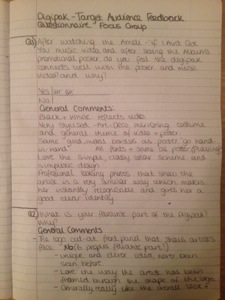
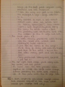
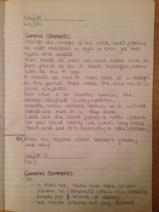
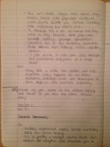
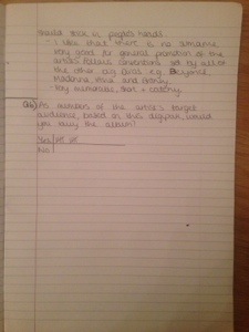
Recently we held a focus group of 10 people that fit the demographic of our target audience in order to see what they think of our digipak. The questions asked consisted of both open and closed questions so that we could go into more detail and pick up on exact criticisms and opinions. Overall the focus group lasted about 30-40 minutes and I feel we obtained some great information and opinions with the general consensus that our digipak was thoroughly enjoyed and interpreted just as we had wished. Here are some images of the notes I took during the session:

20140224-200841.jpg

20140224-200847.jpg

20140224-200852.jpg

20140224-200858.jpg

20140224-200903.jpg

Standard